3 Interesting Facts About Feng Shui and Art Design
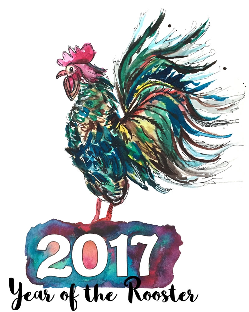
The Chinese New Year is upon us and 2017 is the year of the Rooster!
I love celebrating the Chinese New Year! Chinese culture has always been fascinating to me. It’s been around for so long and although it has a lot of things that Americans may view as silly, I think there is something to it. After all, Chinese customs have been around for a very long time.
For example, the Chinese practice of Feng Shui has been around for over 5000 years! To me that is amazing. I find it interesting and believe there is something to it all. In fact, I incorporate some Feng Shui into my home. We are a military family and move every 3 to 4 years, so whenever it’s time to unpack and arrange a new home, I sometimes use the argument of applying good Feng Shui as a way to arrange the house the way I like verses the way my husband wants it. I know that is messed up of me. My husband could care less about “good” Feng Shui, but he’s patient. He’ll arrange the room, no matter how much his back aches, till I‘m happy with it. He’s a saint.
Last Year, I wrote Boost Creativity With 3 Easy Feng Shui Tips. This year, I thought I’d try something different. What about Feng Shui-ing your art compositions? Things that come to mind are a hand lettering piece, a watercolor painting, or even an abstract mixed media art journal page. After thinking about if for a bit, it dawned on me that some Feng Shui concepts are similar to the basic rules of design. - You see, there IS something to this Feng Shui stuff.
Below are main similarities between Feng Shui and art design.
#1 - Movement
Fung Shui’s goal is to enable the movement of Chi, which is life’s positive energy that brings about all things good and prosperous. In order to get Chi to move, the room needs to be composed with certain rules in mind. The same can be said about design principles. With good design, the artist guides the viewer’s eyes to the focal point while the viewer notices other details that all support the main area.
Movement of the eye is good design. Movement of Chi is good Feng Shui.
#2 – Balance and Contrast
Feng Shui relies on balance of natural elements like wood, fire, earth, metal, and water; complemented by the contrast of yin and yang. The same concept of creating balance is important in art design. Creating contrast with design elements. Different design elements like different colors, sizes of elements, and textures can produce balance and interesting art designs.
# 3 – Rules of Thirds and Odd Numbers
In art design, grouping elements in groups of 3 or odd numbers creates symmetry and is visually pleasing to the eye. The rule of thirds is also visually pleasing when the focal point is off center and placed along the outer thirds of a canvas. In Feng Shui, the rule of thirds is a suggestion that a space be 1/3 functional, 1/3 decorative, and 1/3 room for the Chi to move is ideal.
The moral of the post is that you can never go wrong in using proven design principals of the 5000 year old philosophy of Feng Shui OR the concepts of art design. Following these principals guarantees beautiful cohesive results in your art and living spaces.


